
STARTING FROM THE LOGO
The overall concept of the brand label is to revolve around a hexagon, using simple lines and geometry to form an image of the word “本”, which contains the concepts of “本一” and “WAO”. Our designer uses the word “people” as the blueprint for the design, dividing the pattern into three equal parts, which symbolizes the purpose of “everyone is equal” and “people-oriented”. The ever-expanding combination of “人” patterns represents a group of enthusiastic and conscientious people linking together, and it also means connecting all to form a “one”.
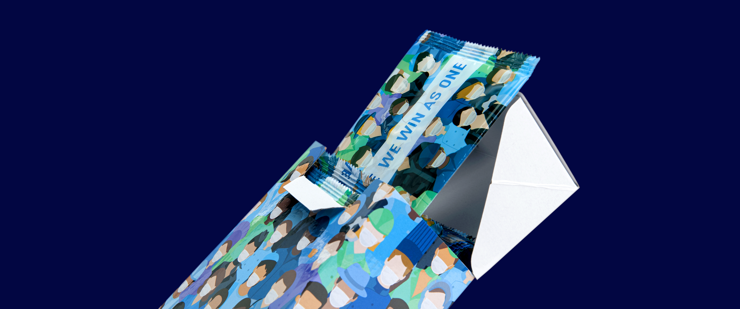
WE FIGHT AS ONE,
WE WIN AS ONE
Virus travels boundary-less , regardless nation, status, race or culture. The only way to overcome this difficult situation is we all unite and fight together, as a family, as a community, as a nation. As one, We are to fight and to win. The entire campaign was launched with the same message across all media, platform as well as packaging.
THE LAUNCH CAMPAIGN;
making a powerful first impression
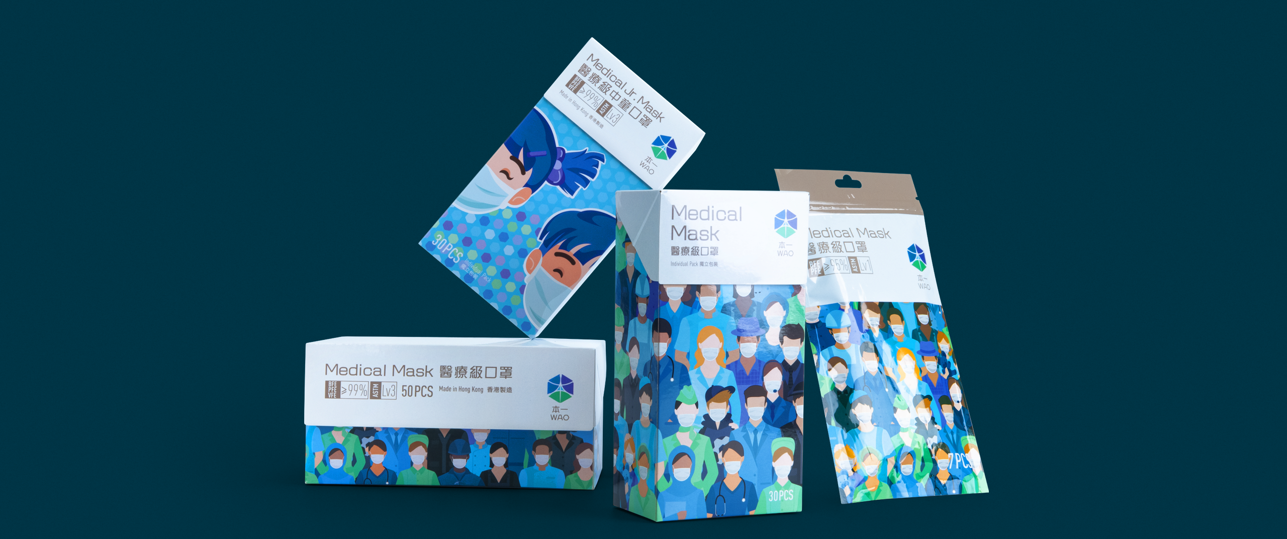
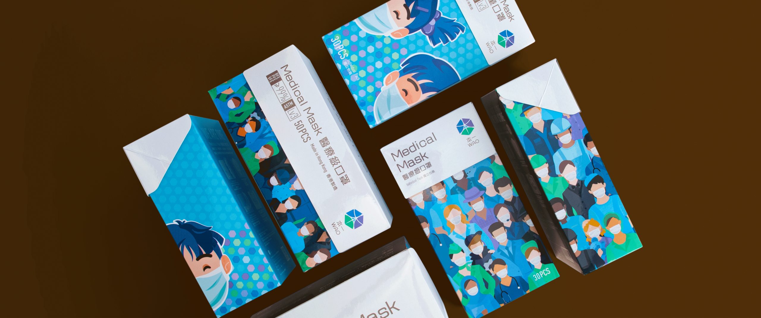
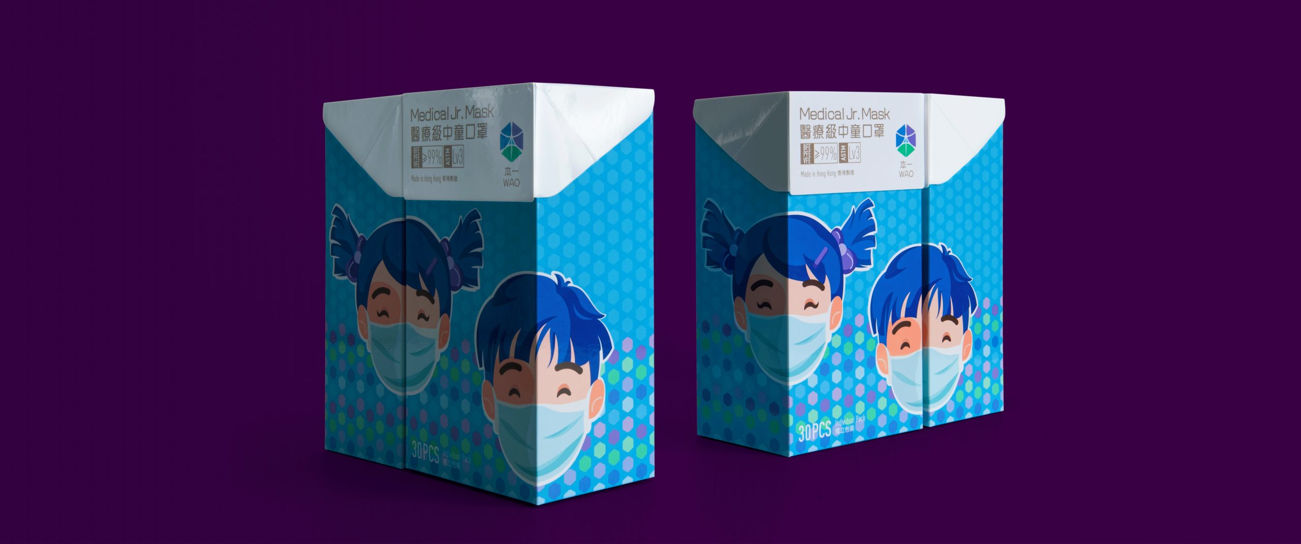
The entire launch campaign included Logo creation, product print, special edition for packaging, e-commerce platform & retail executions to engage the customers in a consistent manner; Our team involved even before the brand was born, strategically planned the launch initiatives from the beginning of the brand journey to hopefully create a conhesive brand DNA and make a powerful start.


Brand Storytelling;
The Future of Marketing
Brand storytelling is the cohensive narrative that pull together the emotions of your target audience as your brand evokes. In addition to giving your customers reasons why they should buy a product or service, businesses need to start sharing the story behind their brand, why it exists, and why this matters, consistently across all communication.